Data transformation
An important tool for tidying data is the option to pivot tables from a wide format to a long format and viceversa. Let’s have a look at these two preliminary cases.
Wide vs Long
In the following case we have a clear example where data are not tidy.
table_colvars## # A tibble: 4 x 4
## country `2020` `2021` `2022`
## <chr> <dbl> <dbl> <dbl>
## 1 Italy 12 9 7
## 2 France 13 10 9
## 3 Germany 11 8 10
## 4 Belgium 14 12 14Columns do not represent different variables, they are a variable themselves. In order to use these data properly, we should move those values into a column, and therefore pivot the table from this wide format to a longer one.
We do that, by using the code below:
table_colvars %>%
  pivot_longer(
    cols = c(`2020`:`2022`),
    names_to = "year",
    values_to = "cases"
  )
## # A tibble: 12 x 3
## country year cases
## <chr> <chr> <dbl>
## 1 Italy 2020 12
## 2 Italy 2021 9
## 3 Italy 2022 7
## 4 France 2020 13
## 5 France 2021 10
## 6 France 2022 9
## 7 Germany 2020 11
## 8 Germany 2021 8
## 9 Germany 2022 10
## 10 Belgium 2020 14
## 11 Belgium 2021 12
## 12 Belgium 2022 14Now colums are consistent with a single variable representation, and rows represent indeed one single record per variable combination.
Let’s have a look at this second table, were we have the opposite case:
table_diffvars## # A tibble: 16 x 4
## country year type count
## <chr> <dbl> <chr> <dbl>
## 1 Italy 2020 cases 12
## 2 Italy 2020 population 34564
## 3 Italy 2021 cases 11
## 4 Italy 2021 population 34575
## 5 France 2020 cases 13
## 6 France 2020 population 7656564
## 7 France 2021 cases 10
## 8 France 2021 population 7656874
## 9 Germany 2020 cases 11
## 10 Germany 2020 population 909987
## 11 Germany 2021 cases 9
## 12 Germany 2021 population 910987
## 13 Belgium 2020 cases 14
## 14 Belgium 2020 population 87667
## 15 Belgium 2021 cases 8
## 16 Belgium 2021 population 87887Here we have one column that actually represents two distinct variables, both indicating an integer count of different entities though. They should be two separate columns. We can do this, by pivoting the table to a wider format, as with the code below:
table_diffvars %>%
  pivot_wider(
    names_from = type,
    values_from = count
  )
## # A tibble: 8 x 4
## country year cases population
## <chr> <dbl> <dbl> <dbl>
## 1 Italy 2020 12 34564
## 2 Italy 2021 11 34575
## 3 France 2020 13 7656564
## 4 France 2021 10 7656874
## 5 Germany 2020 11 909987
## 6 Germany 2021 9 910987
## 7 Belgium 2020 14 87667
## 8 Belgium 2021 8 87887Filter
Filtering is an important step in tidying the data and sometimes also in simplifying the plots: this can be done in tidyverse with the following code:
table_diffvars %>%
  pivot_wider(
    names_from = type,
    values_from = count
  ) %>%
  filter(year == 2020)
## # A tibble: 4 x 4
## country year cases population
## <chr> <dbl> <dbl> <dbl>
## 1 Italy 2020 12 34564
## 2 France 2020 13 7656564
## 3 Germany 2020 11 909987
## 4 Belgium 2020 14 87667Select
we can also select specific columns
table_diffvars %>%
  pivot_wider(
    names_from = type,
    values_from = count
  ) %>%
  select(country,year,population)
## # A tibble: 8 x 3
## country year population
## <chr> <dbl> <dbl>
## 1 Italy 2020 34564
## 2 Italy 2021 34575
## 3 France 2020 7656564
## 4 France 2021 7656874
## 5 Germany 2020 909987
## 6 Germany 2021 910987
## 7 Belgium 2020 87667
## 8 Belgium 2021 87887Add variables
and use mutate to add variables from calculations we have made:
table_diffvars %>%
  pivot_wider(
    names_from = type,
    values_from = count
  ) %>%
  mutate(
    perc_cases = cases/population * 100
  )
## # A tibble: 8 x 5
## country year cases population perc_cases
## <chr> <dbl> <dbl> <dbl> <dbl>
## 1 Italy 2020 12 34564 0.0347
## 2 Italy 2021 11 34575 0.0318
## 3 France 2020 13 7656564 0.000170
## 4 France 2021 10 7656874 0.000131
## 5 Germany 2020 11 909987 0.00121
## 6 Germany 2021 9 910987 0.000988
## 7 Belgium 2020 14 87667 0.0160
## 8 Belgium 2021 8 87887 0.00910Groups and summaries
Grouping the data is also an important tool to better represent the information we have in our datasets, and we can then create summaries resulting from the operations done by groups:
table_diffvars %>%
  pivot_wider(
    names_from = type,
    values_from = count
  ) %>%
  mutate(
    perc_cases = cases/population * 100
  ) %>%
  group_by(country) %>%
  summarise(
    avg_population = mean(population),
    avg_cases = mean(cases)
  )
## # A tibble: 4 x 3
## country avg_population avg_cases
## <chr> <dbl> <dbl>
## 1 Belgium 87777 11
## 2 France 7656719 11.5
## 3 Germany 910487 10
## 4 Italy 34570. 11.5Arrange rows
Rows can be arranged using the arrange function:
table_diffvars %>%
  pivot_wider(
    names_from = type,
    values_from = count
  ) %>%
  mutate(
    perc_cases = cases/population * 100
  ) %>%
  group_by(country) %>%
  summarise(
    avg_population = mean(population),
    avg_cases = mean(cases)
  ) %>%
  arrange(avg_population)
## # A tibble: 4 x 3
## country avg_population avg_cases
## <chr> <dbl> <dbl>
## 1 Italy 34570. 11.5
## 2 Belgium 87777 11
## 3 Germany 910487 10
## 4 France 7656719 11.5Basic concepts
ggplot is built as introduced in the presentation using the key components of grammar of graphics:
- a dataset
- mapping the data to an aestethics
- a statistical transformation
- a geometry (which might involve a statistics)
- scales
- facets
To see this we are going to use the dataset mpg which reports fuel data on 38 popular models of cars.
Let’s see them:
ggplot(mpg, aes(x=class, fill = class))+
  geom_bar()
if we don’t use a y value, we can use the geometry “bar”which relies on counts as default statistics. Alternatively we can transform the data
mpg %>%
  group_by(class) %>%
  summarise(count = n()) %>%
  ggplot(aes(x=class, y=count, fill = class))+
  geom_bar(stat = "identity")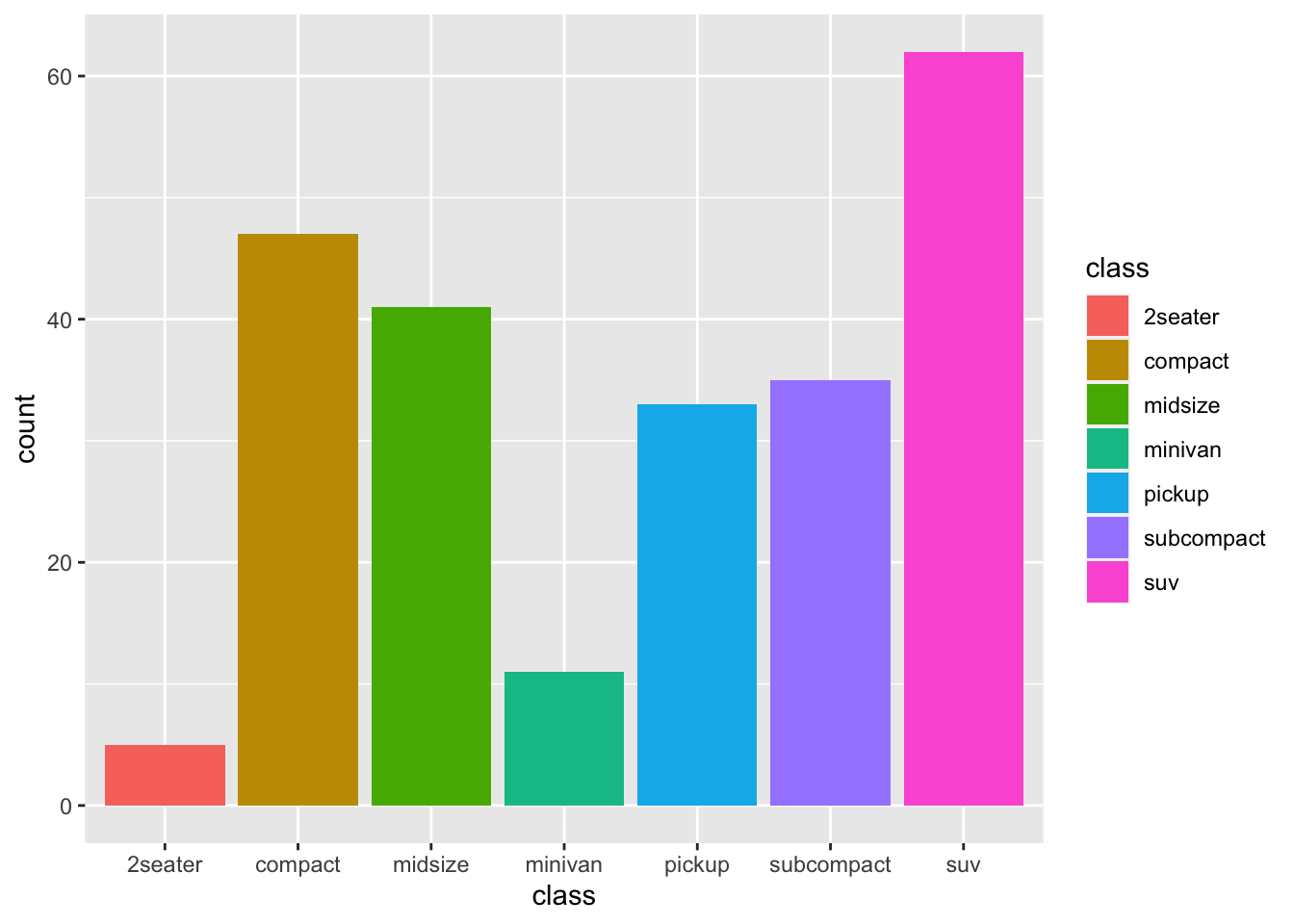
The result is identical, we have changed the statistics of the geometry to accept an exact value for the y-axis without calculating a count or frequency.
This allows us to do an additional step, useful for visualisation, i.e. arranging the bars
mpg %>%
  group_by(class) %>%
  summarise(count = n()) %>%
  ggplot(aes(x=reorder(class, -count), y=count, fill = class))+
  geom_bar(stat = "identity")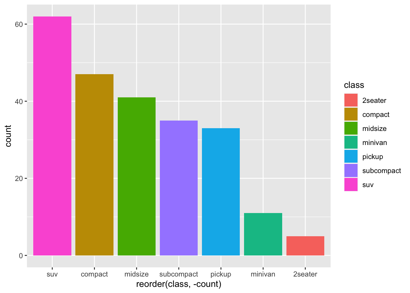
Another thing many people like to do is to flip the coordinates
mpg %>%
  group_by(class) %>%
  summarise(count = n()) %>%
  ggplot(aes(x=reorder(class, -count), y=count, fill = class))+
  geom_bar(stat = "identity")+
  coord_flip()
We need to customise a little the plot by adding the correct labels, remembering we flipped the coordinates:
mpg %>%
  group_by(class) %>%
  summarise(count = n()) %>%
  ggplot(aes(x=reorder(class, -count), y=count, fill = class))+
  geom_bar(stat = "identity")+
  coord_flip()+
  labs(y = "no. cars", x="class of car", title = "Number of cars produced by class")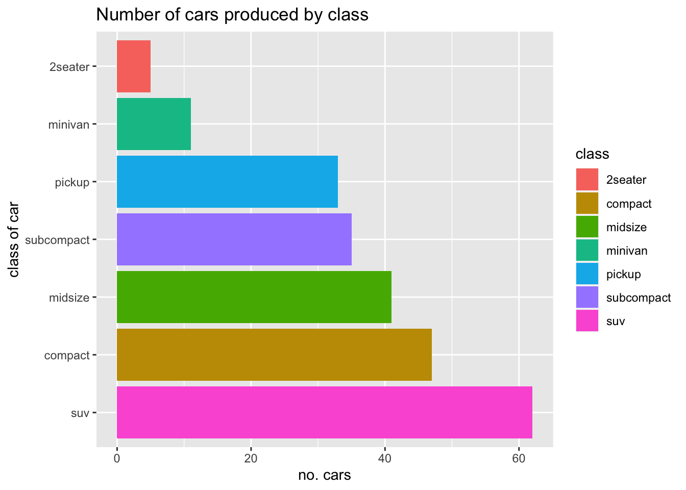
Now let’s have a look at other elements, like facets and use another plot type:
ggplot(mpg, aes(x=displ, y=hwy))+
  geom_point(colour = "blue")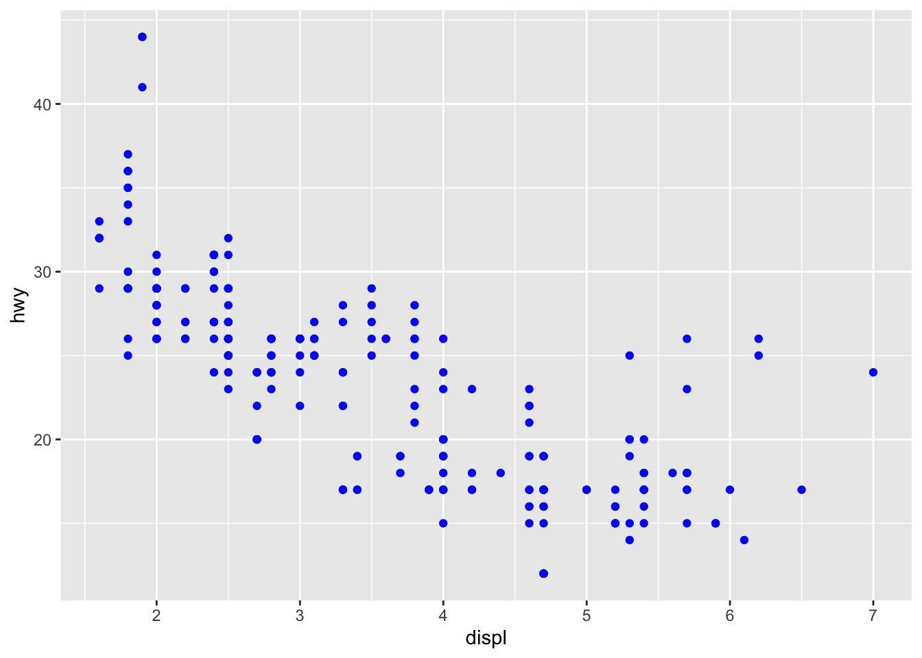
Representations
This allows us to introduce one of the three elements of visualisation seen in the introduction, and start with relationships.
Relationships
Scatterplots with fits are usually a good (and very “statistical”) way to show relationships or trends
We can modify the above plot to show the fit:
ggplot(mpg, aes(x=displ, y=hwy))+
  geom_point(colour = "blue")+
  geom_smooth(method = "lm", colour = "red")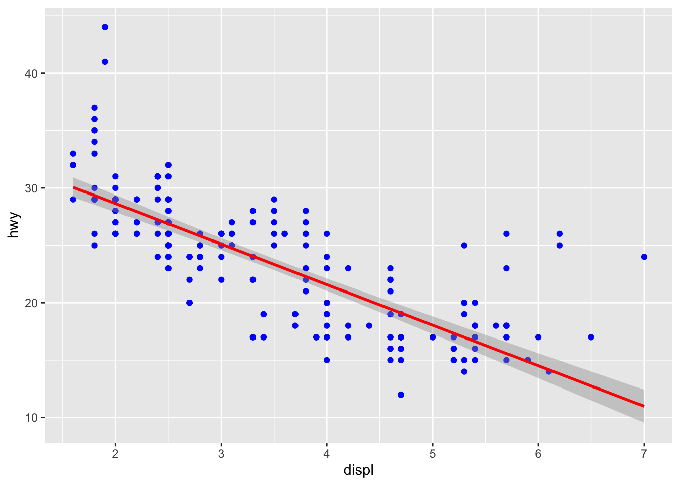
If we believe a linear model (i.e. lm) is not particularly ideal here, we can use a local polynomial regression or LOESS (which stands for locally estimated scatterplot smoothing):
ggplot(mpg, aes(x=displ, y=hwy))+
  geom_point(colour = "blue")+
  geom_smooth(method = "loess", colour = "red")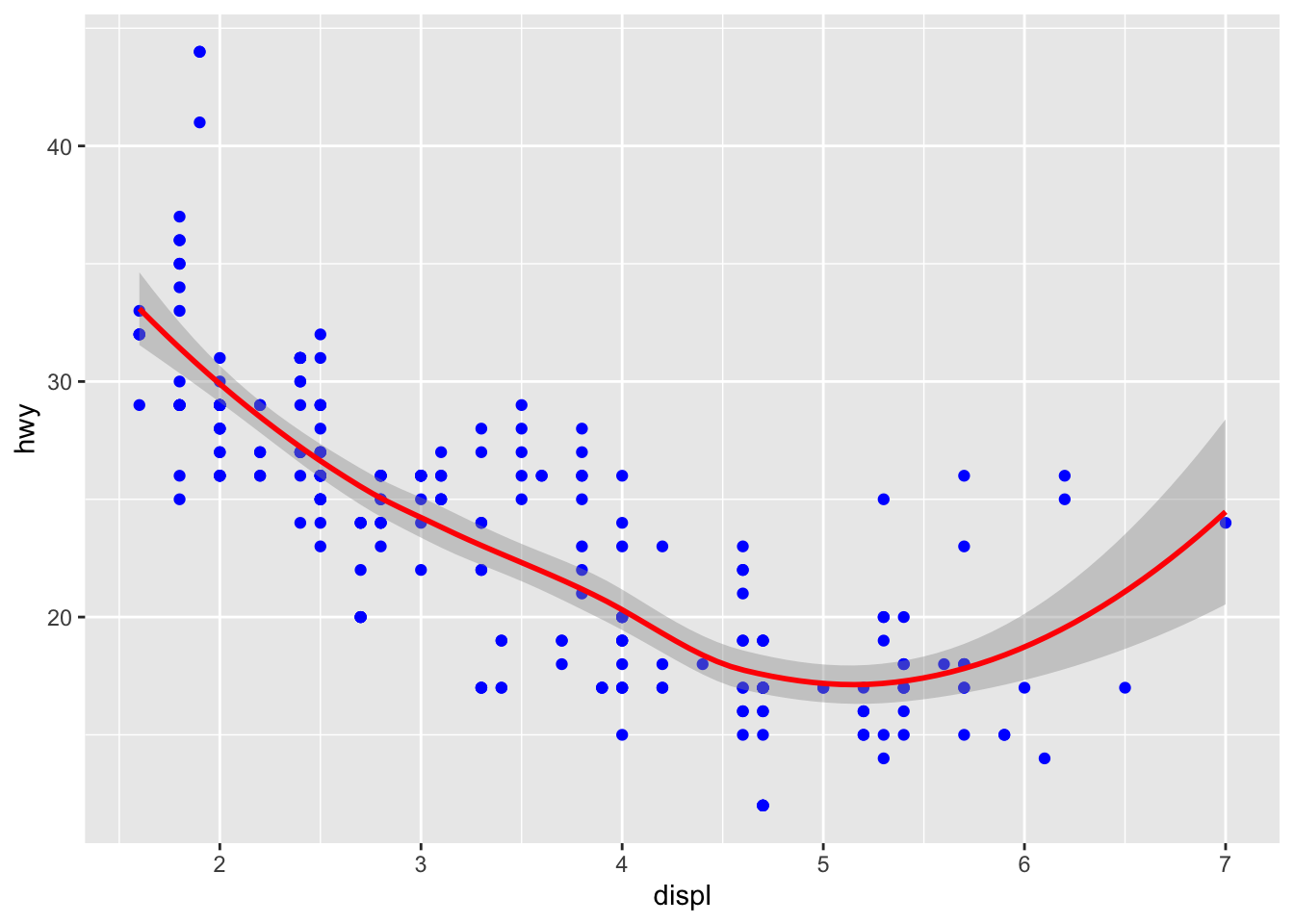
The relationships between engine displacement and fuel consumption on the highway might be however different depending on the manufacturer. We could explore this by using faceting:
ggplot(mpg, aes(x=displ, y=hwy))+
  geom_point(colour = "blue")+
  geom_smooth(method = "loess", colour = "red")+
  facet_wrap(~manufacturer, ncol = 3)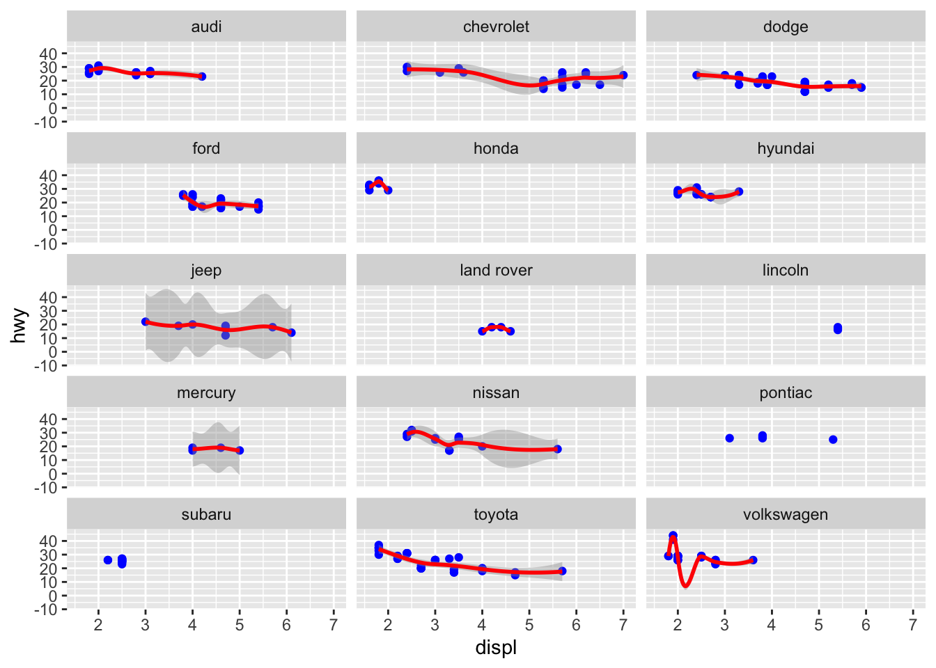
Here we can already see:
- some manufacturer have a smaller range of engine displacement engines
- some datapoints are not enough to fit a loess regression
We can also cheat a little on the axes to view better some data, but this is something one should be very careful about:
ggplot(mpg, aes(x=displ, y=hwy))+
  geom_point(colour = "blue")+
  geom_smooth(method = "loess", colour = "red")+
  facet_wrap(~manufacturer, ncol = 3, scales = "free")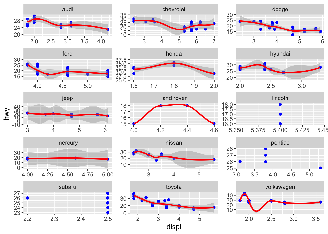
Patterns
Another element we have seen in the introduction is that we are pretty good at spotting patterns, and particularly trends (for example over time) Here, a basic rule is to remember we should simplify / reduce data points, to highlight the pattern better.
In this case we use the dataset on housing sales in texas.
ggplot(txhousing,
       aes(x=date, y=sales))+
  geom_bar(stat = "identity")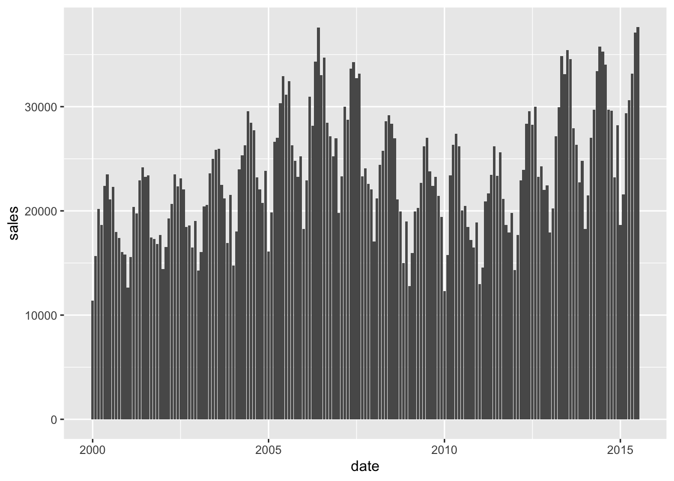
The plot is a little messy, and doesn’t allow us to see very well. We can try and simplify the plot by plotting by year, and for this we need to summarise the data a little as we have seen before:
txhousing %>%
  group_by(year) %>%
  summarise(avg_sales = mean(sales, na.rm = TRUE),
            sum_sales = sum(sales, na.rm = TRUE)) %>%
  ggplot(aes(x = year, y = sum_sales))+
  geom_bar(stat = "identity")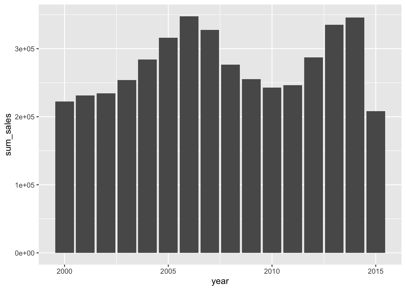
Besides bars, lines are also a very good way in particular if we wanted to compare things: we might want to see the trend of sales over the years, and by city
ggplot(txhousing, aes(x=date, y=sales, colour = city))+
  geom_line()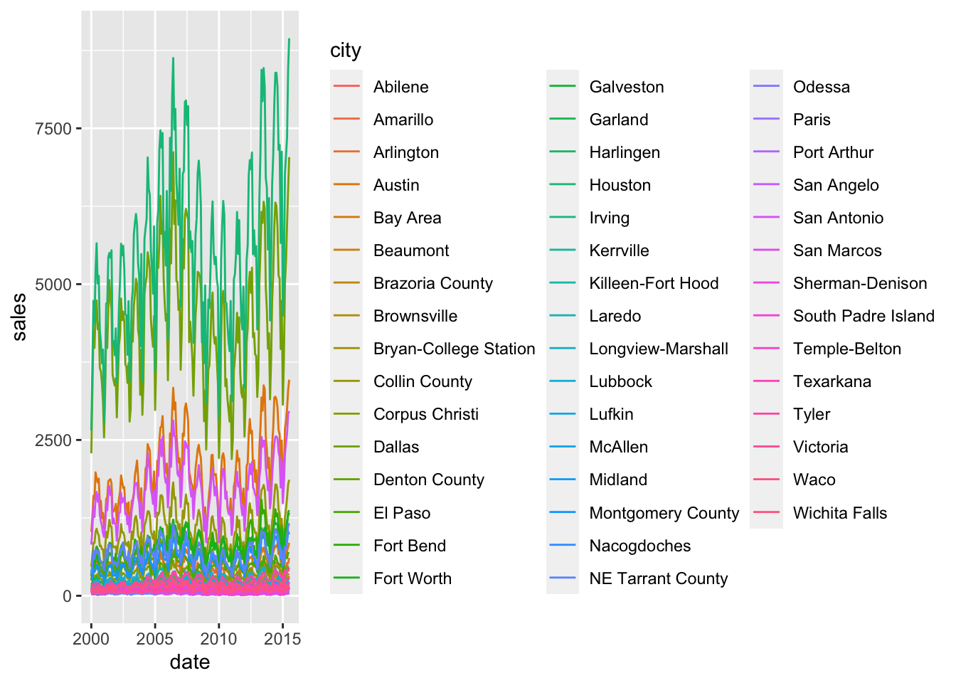
however, this is terribly messy. there’s a few things we can do, with the goal of reducing the complexity.
First of all, we can remove the legend:
ggplot(txhousing, aes(x=date, y=sales, colour = city))+
  geom_line()+
  theme(legend.position = "none")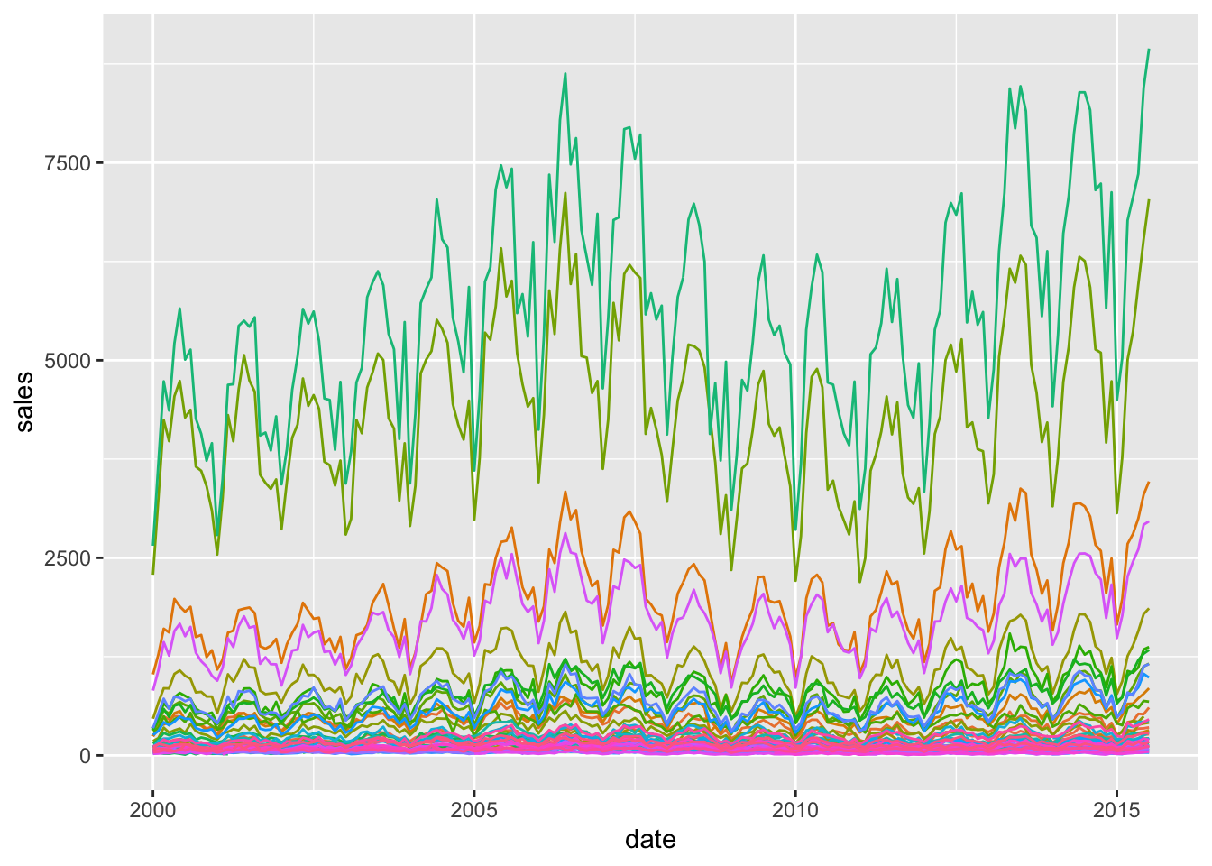
But the plot is unreadable and there’s so many colours.
Plus, we notice also that probably large cities also stand apart, and it becomes difficult to make real comparisons. Here we stress again the relationship between the data and the visualisation. Let’s consider the proportion over the number of listings, i.e. the successful sales if we may.
txhousing %>%
  mutate(proportion_sales = sales / listings * 100) %>%
  ggplot(aes(x=date, y=proportion_sales, colour = city))+
  geom_line()+
  theme(legend.position = "none")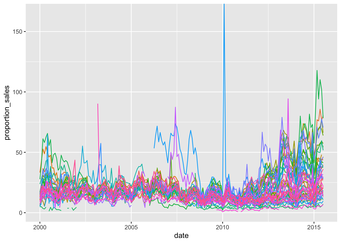
Clearly there’s something going on - whatever the reasons in the data - when the sales are higher than listings, let’s check it:
txhousing %>%
  filter(sales > listings)
## # A tibble: 5 x 9
## city year month sales volume median listings inventory date
## <chr> <int> <int> <dbl> <dbl> <dbl> <dbl> <dbl> <dbl>
## 1 Garland 2015 3 172 25582593 135900 146 0.8 2015.
## 2 Garland 2015 5 195 32018011 151000 177 1 2015.
## 3 Garland 2015 6 212 35772714 154800 208 1.2 2015.
## 4 Midland 2010 2 100 19880017 175400 0 0 2010.
## 5 Odessa 2008 8 150 23100000 136700 91 0.8 2009.We don’t know the reason for this, but let’s remove these data points which seem difficult to explain without additional information:
txhousing %>%
  filter(sales < listings) %>%
  mutate(proportion_sales = sales / listings * 100) %>%
  ggplot(aes(x=date, y=proportion_sales, colour = city))+
  geom_line()+
  theme(legend.position = "none")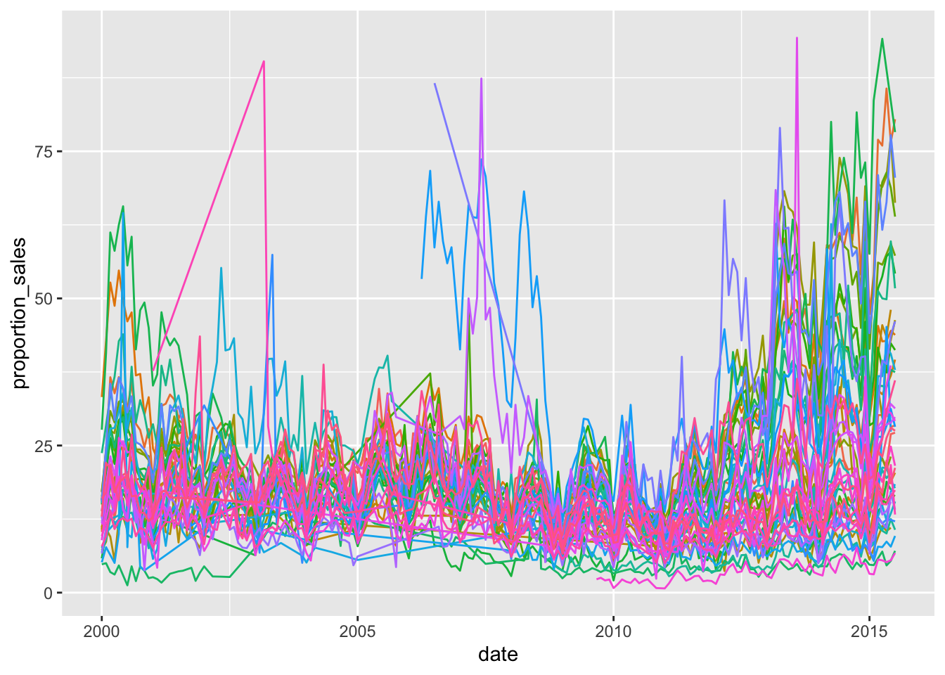
The plot is still very messy. There’s something we could do, quite easily and it uses the highlights package to highlight only those cities which kept the majority of sales above 25% of the listings:
txhousing %>%
  filter(sales < listings) %>%
  mutate(proportion_sales = sales / listings * 100) %>%
  ggplot(aes(x=date, y=proportion_sales, colour = city))+
  geom_line()+
  theme(legend.position = "none")+
  gghighlight(median(proportion_sales) > 25)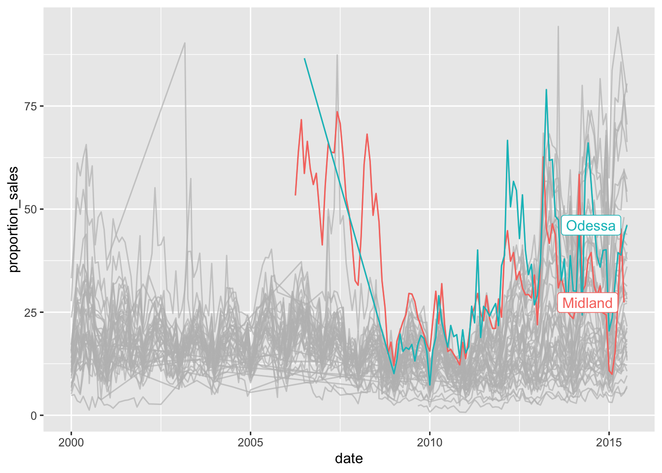
But we could also highlight those below a certain threshold:
txhousing %>%
  filter(sales < listings) %>%
  mutate(proportion_sales = sales / listings * 100) %>%
  ggplot(aes(x=date, y=proportion_sales, colour = city))+
  geom_line()+
  theme(legend.position = "none")+
  gghighlight(median(proportion_sales) > 25 | median(proportion_sales) < 5)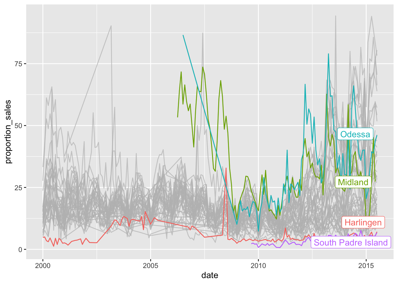
If we don’t like the labels there, we can put them on a side (we need to remove the setting on legends):
txhousing %>%
  filter(sales < listings) %>%
  mutate(proportion_sales = sales / listings * 100) %>%
  ggplot(aes(x=date, y=proportion_sales, colour = city))+
  geom_line()+
  gghighlight(median(proportion_sales) > 25 | median(proportion_sales) < 5, use_direct_label = FALSE)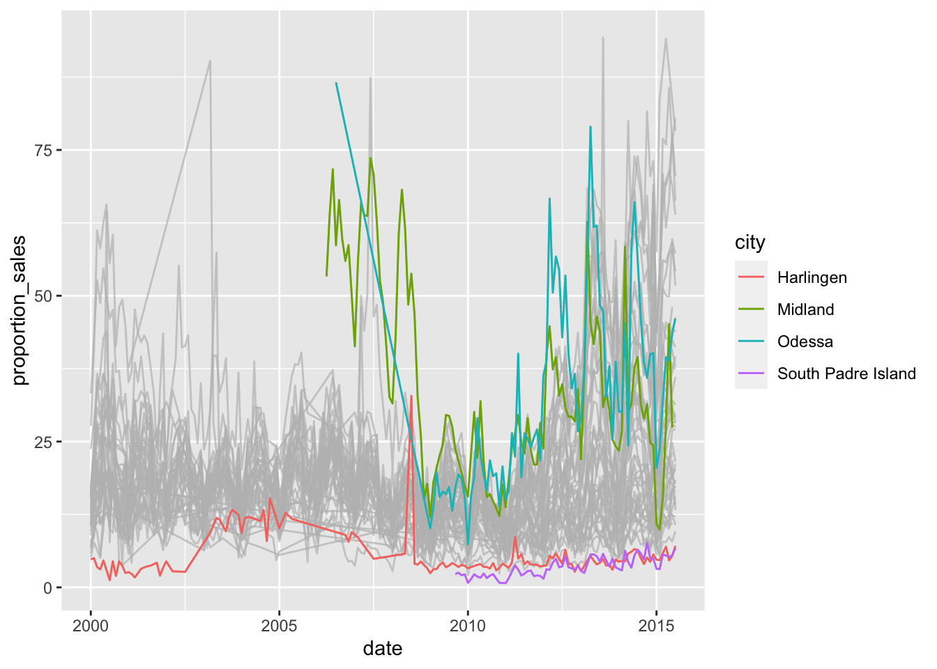
Let’s go back to bars again, as a way to show some patterns:
mpg %>%
  group_by(trans, class) %>%
  summarise(
    avg_hwy = mean(hwy)
  ) %>%
  ggplot(aes(x = class, y = avg_hwy, fill = trans))+
  geom_bar(stat = "identity", position = "dodge")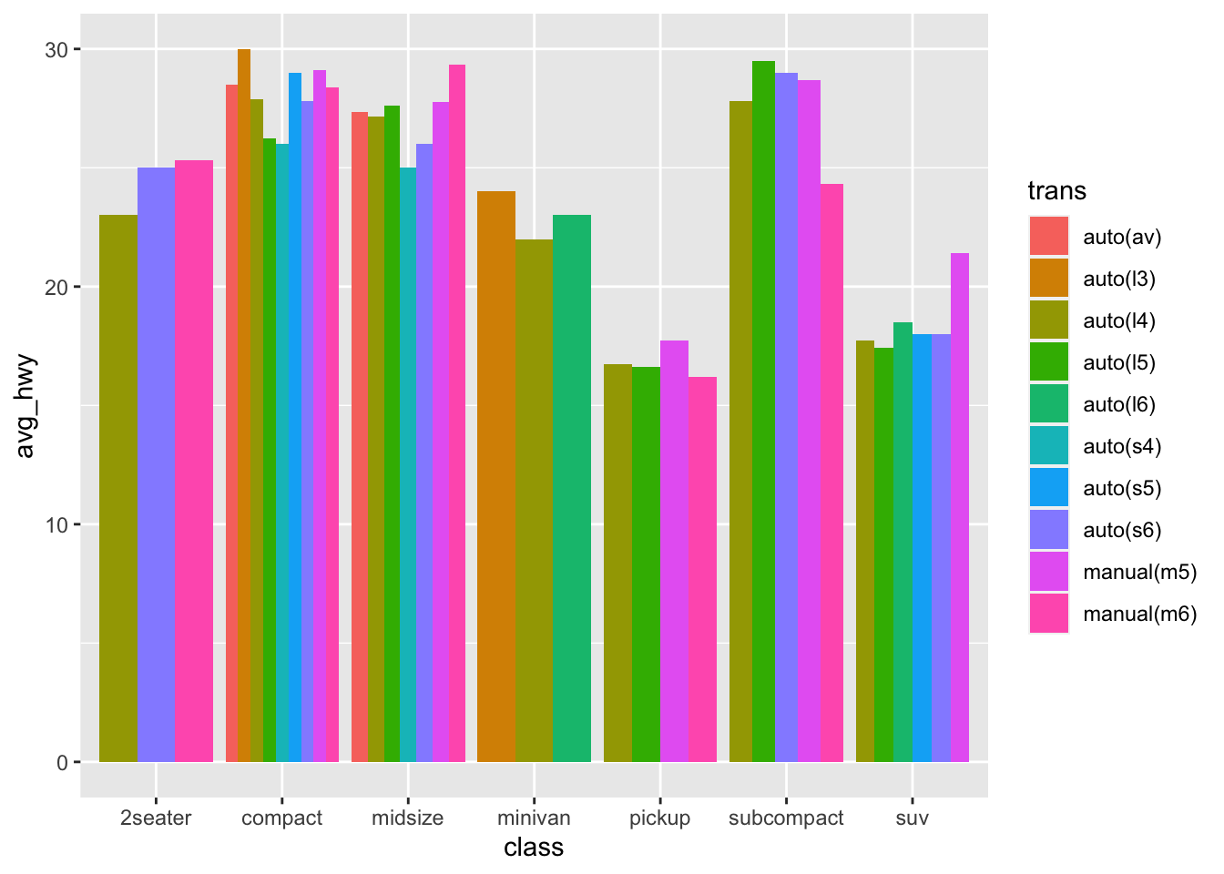
Now the problem with this, is that it’s too cluttered and we can’t really compare what we’d like to see. If the goal is to show the impact of car class has on miles per gallon, then we should separate the transmission types.
mpg %>%
  group_by(trans, class) %>%
  summarise(
    avg_hwy = mean(hwy)
  ) %>%
  ggplot(aes(x = class, y = avg_hwy, fill = trans))+
  geom_bar(stat = "identity", position = "dodge")+
  facet_wrap(~trans)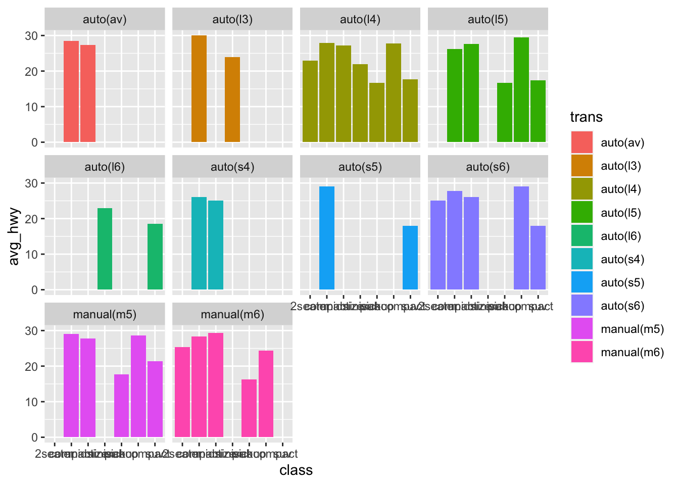
Now last element is that x-axis labels overlap, so we can dodge them:
mpg %>%
  group_by(trans, class) %>%
  summarise(
    avg_hwy = mean(hwy)
  ) %>%
  ggplot(aes(x = class, y = avg_hwy, fill = trans))+
  geom_bar(stat = "identity", position = "dodge")+
  facet_wrap(~trans)+
  scale_x_discrete(guide = guide_axis(n.dodge=2))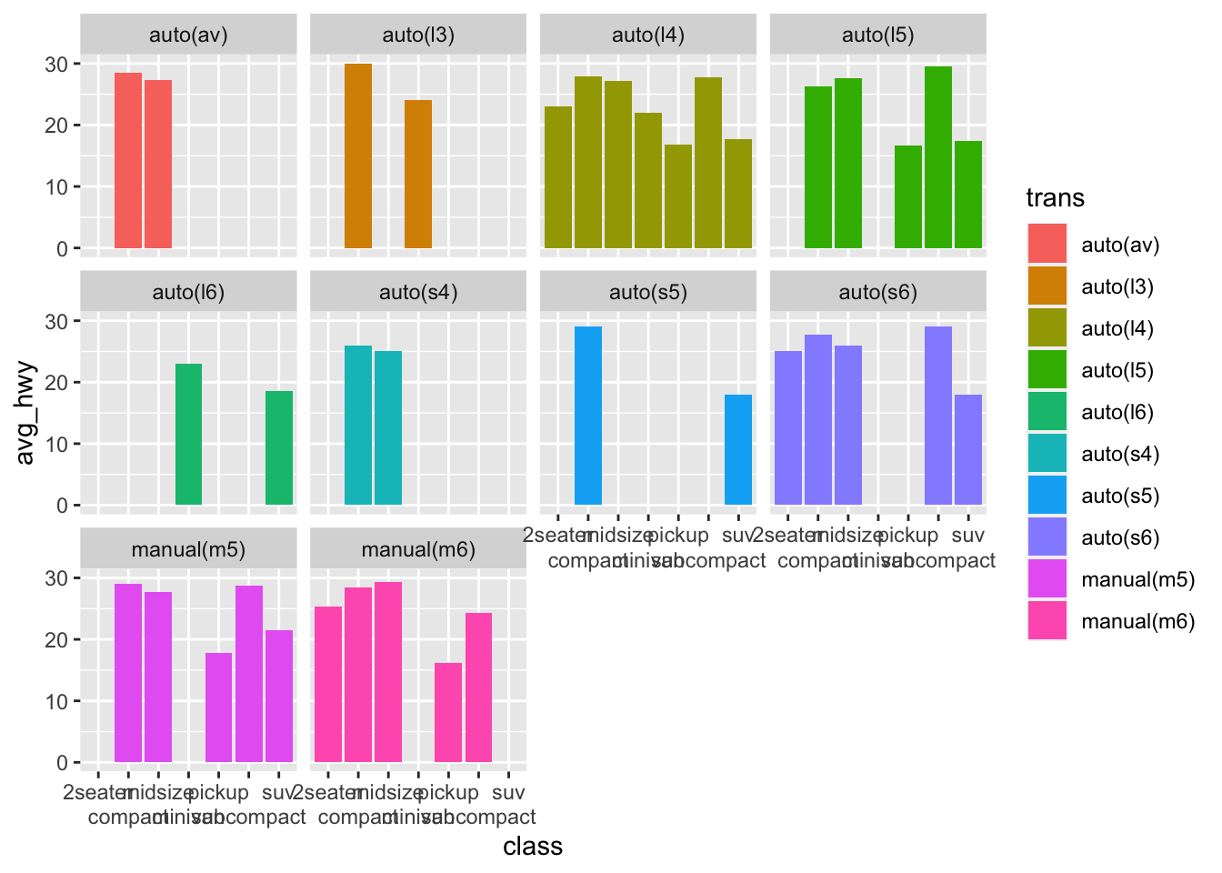
Proportions
An interesting data to explore is the expanded sleep dataset on mammals (msleep)
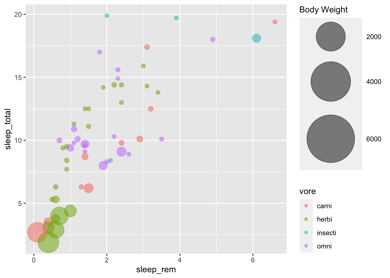
We will discuss pie charts in the next tutorial about storytelling. Let’s have a look at a different way to represent proportions, with bubble charts.
msleep %>%
  arrange(bodywt) %>%
  filter(!is.na(vore)) %>%
  ggplot(aes(x=sleep_rem, y=sleep_total, colour = vore))+
  geom_point(alpha=0.5, aes(size = bodywt))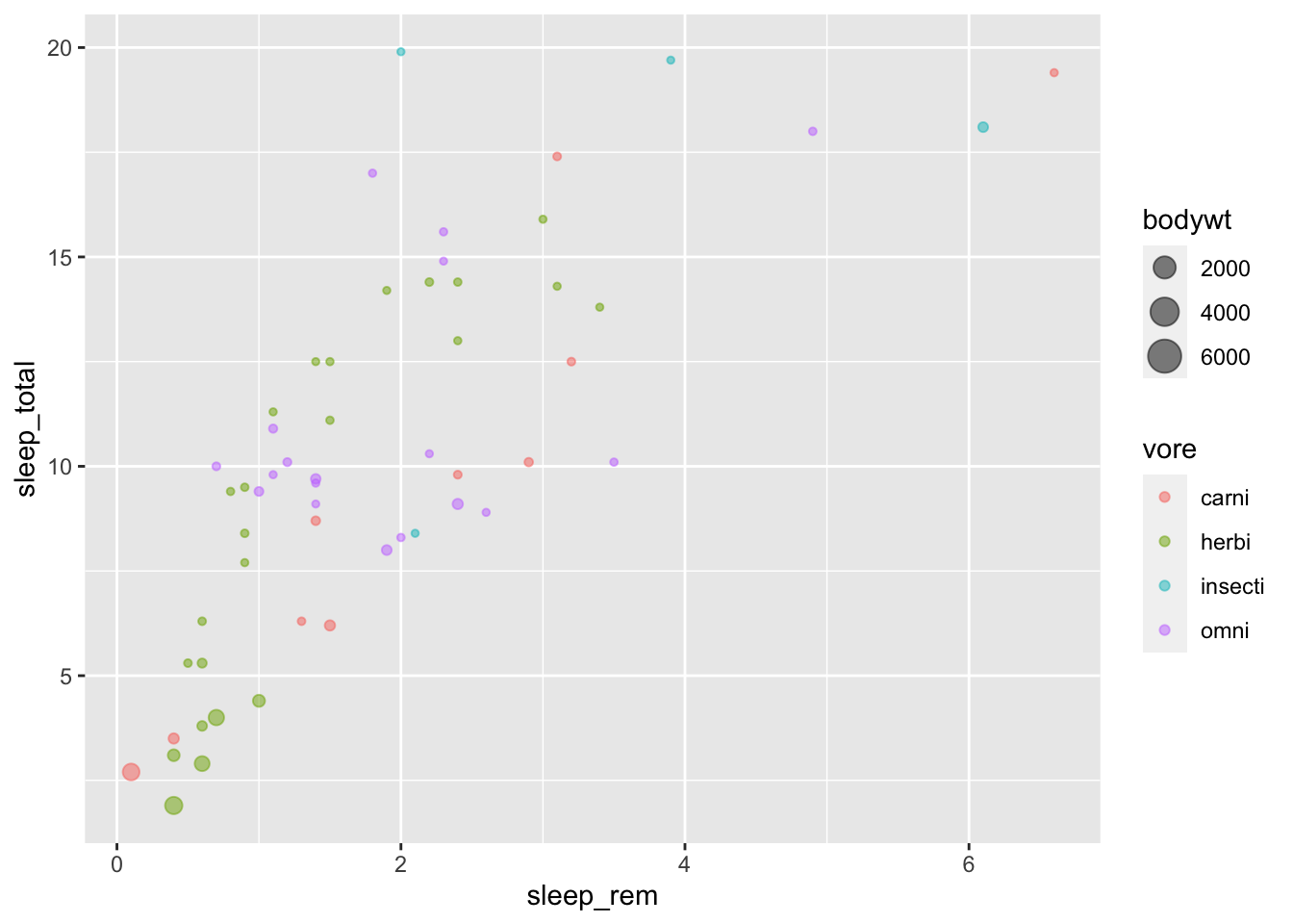
But we can make it prettier, and control better the size using scales:
msleep %>%
  arrange(bodywt) %>%
  filter(!is.na(vore)) %>%
  ggplot(aes(x=sleep_rem, y=sleep_total, colour = vore))+
  geom_point(alpha=0.5, aes(size = bodywt))+
  scale_size(range = c(2, 30), name="Body Weight")