Loading data
To showcase the approach to storytelling, we have chosen a dataset on Attitudes towards Mental Illnesses. This is the collection of 2016 OSMI survey results.
First we need to load the necessary packages:
library(tidyverse)
library(cowplot)
library(gghighlight)
library(knitr)
library(MetBrewer)
library(treemapify)
library(kableExtra)
Then we can load the dataset straight from the repository on github:
data <- read_csv("https://raw.githubusercontent.com/lescai-teaching/dataviz-rstudio/datasets/mental-heath-in-tech-2016_20161114.csv")We can now inspect what the dataset contains, by printing a table of its variables:
names(data) %>%
  kable("html") %>%
  kable_styling(font_size = 7,
                bootstrap_options = "striped",
                full_width = F,
                position = "center"
)| x |
|---|
| Are you self-employed? |
| How many employees does your company or organization have? |
| Is your employer primarily a tech company/organization? |
| Is your primary role within your company related to tech/IT? |
| Does your employer provide mental health benefits as part of healthcare coverage? |
| Do you know the options for mental health care available under your employer-provided coverage? |
| Has your employer ever formally discussed mental health (for example, as part of a wellness campaign or other official communication)? |
| Does your employer offer resources to learn more about mental health concerns and options for seeking help? |
| Is your anonymity protected if you choose to take advantage of mental health or substance abuse treatment resources provided by your employer? |
| If a mental health issue prompted you to request a medical leave from work, asking for that leave would be: |
| Do you think that discussing a mental health disorder with your employer would have negative consequences? |
| Do you think that discussing a physical health issue with your employer would have negative consequences? |
| Would you feel comfortable discussing a mental health disorder with your coworkers? |
| Would you feel comfortable discussing a mental health disorder with your direct supervisor(s)? |
| Do you feel that your employer takes mental health as seriously as physical health? |
| Have you heard of or observed negative consequences for co-workers who have been open about mental health issues in your workplace? |
| Do you have medical coverage (private insurance or state-provided) which includes treatment of mental health issues? |
| Do you know local or online resources to seek help for a mental health disorder? |
| If you have been diagnosed or treated for a mental health disorder, do you ever reveal this to clients or business contacts? |
| If you have revealed a mental health issue to a client or business contact, do you believe this has impacted you negatively? |
| If you have been diagnosed or treated for a mental health disorder, do you ever reveal this to coworkers or employees? |
| If you have revealed a mental health issue to a coworker or employee, do you believe this has impacted you negatively? |
| Do you believe your productivity is ever affected by a mental health issue? |
| If yes, what percentage of your work time (time performing primary or secondary job functions) is affected by a mental health issue? |
| Do you have previous employers? |
| Have your previous employers provided mental health benefits? |
| Were you aware of the options for mental health care provided by your previous employers? |
| Did your previous employers ever formally discuss mental health (as part of a wellness campaign or other official communication)? |
| Did your previous employers provide resources to learn more about mental health issues and how to seek help? |
| Was your anonymity protected if you chose to take advantage of mental health or substance abuse treatment resources with previous employers? |
| Do you think that discussing a mental health disorder with previous employers would have negative consequences? |
| Do you think that discussing a physical health issue with previous employers would have negative consequences? |
| Would you have been willing to discuss a mental health issue with your previous co-workers? |
| Would you have been willing to discuss a mental health issue with your direct supervisor(s)? |
| Did you feel that your previous employers took mental health as seriously as physical health? |
| Did you hear of or observe negative consequences for co-workers with mental health issues in your previous workplaces? |
| Would you be willing to bring up a physical health issue with a potential employer in an interview? |
| Why or why not? |
| Would you bring up a mental health issue with a potential employer in an interview? |
| Why or why not?_1 |
| Do you feel that being identified as a person with a mental health issue would hurt your career? |
| Do you think that team members/co-workers would view you more negatively if they knew you suffered from a mental health issue? |
| How willing would you be to share with friends and family that you have a mental illness? |
| Have you observed or experienced an unsupportive or badly handled response to a mental health issue in your current or previous workplace? |
| Have your observations of how another individual who discussed a mental health disorder made you less likely to reveal a mental health issue yourself in your current workplace? |
| Do you have a family history of mental illness? |
| Have you had a mental health disorder in the past? |
| Do you currently have a mental health disorder? |
| If yes, what condition(s) have you been diagnosed with? |
| If maybe, what condition(s) do you believe you have? |
| Have you been diagnosed with a mental health condition by a medical professional? |
| If so, what condition(s) were you diagnosed with? |
| Have you ever sought treatment for a mental health issue from a mental health professional? |
| If you have a mental health issue, do you feel that it interferes with your work when being treated effectively? |
| If you have a mental health issue, do you feel that it interferes with your work when NOT being treated effectively? |
| What is your age? |
| What is your gender? |
| What country do you live in? |
| What US state or territory do you live in? |
| What country do you work in? |
| What US state or territory do you work in? |
| Which of the following best describes your work position? |
| Do you work remotely? |
Exploring the data
When we build the following code, one can use tab to navigate long columns / variable names. First we will create a basic bar plot, and take it from there:
data %>%
  ggplot(aes(x=`Do you think that discussing a physical health issue with previous employers would have negative consequences?`,
             fill=`Do you think that discussing a physical health issue with previous employers would have negative consequences?`
             ))+
  geom_bar()
In a plot, this is not even visible in the figure box. The categories clearly include NA values, which need to be removed. We do that with the following code:
data %>%
  filter(!is.na(`Do you think that discussing a physical health issue with previous employers would have negative consequences?`)) %>%
  ggplot(aes(x=`Do you think that discussing a physical health issue with previous employers would have negative consequences?`,
             fill=`Do you think that discussing a physical health issue with previous employers would have negative consequences?`
  ))+
  geom_bar()
This figure has the same problem, and it is not even visible on a figure box in the page.
The title in the legend duplicates information, so we can just remove the title keeping the legend as it is with the following code:
data %>%
  filter(!is.na(`Do you think that discussing a physical health issue with previous employers would have negative consequences?`)) %>%
  ggplot(aes(x=`Do you think that discussing a physical health issue with previous employers would have negative consequences?`,
             fill=`Do you think that discussing a physical health issue with previous employers would have negative consequences?`
  ))+
  geom_bar()+
  theme(legend.title = element_blank())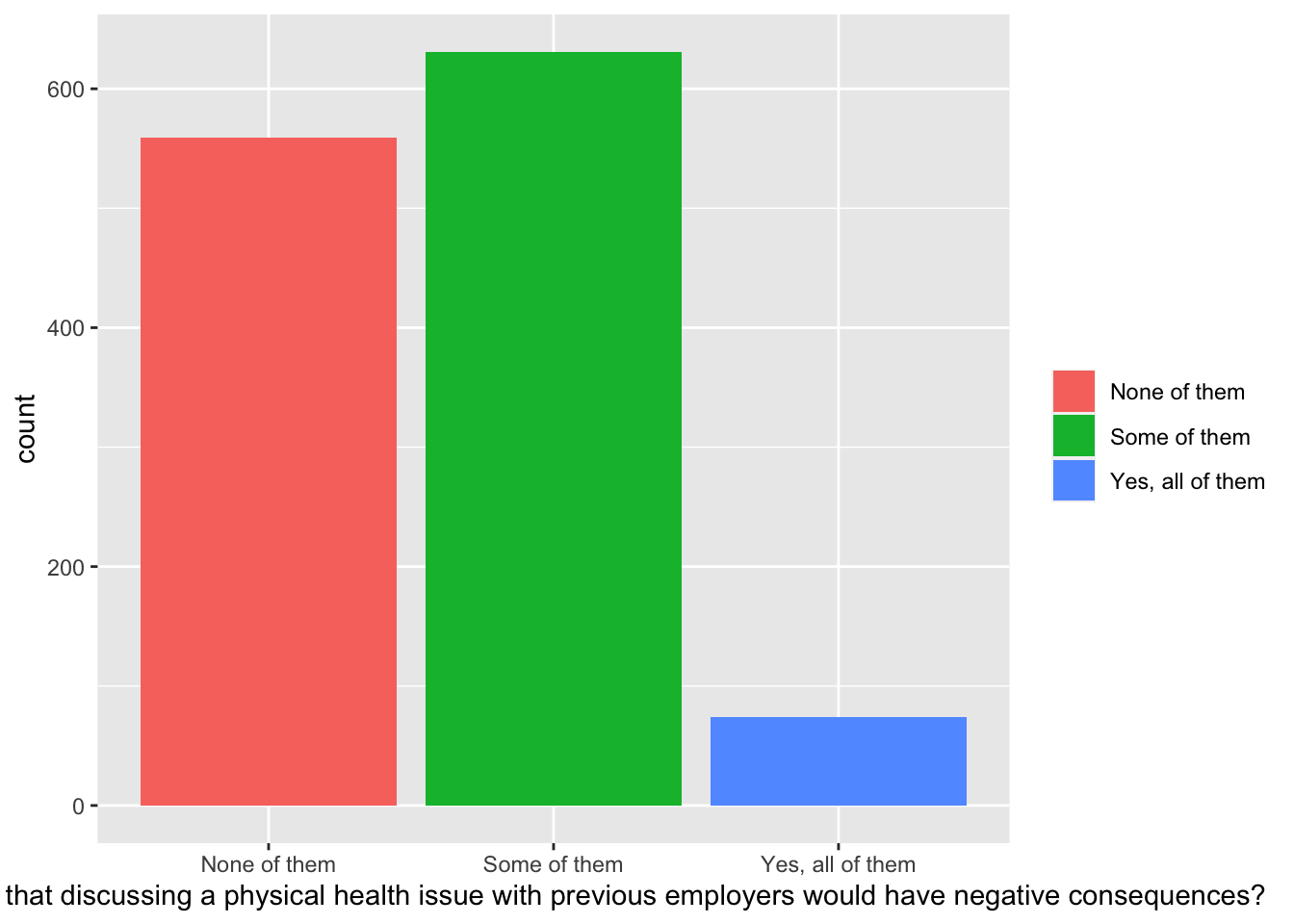
Now maybe we could appreciate better the proportions of the different categories, if we fill one column as follows:
data %>%
  filter(!is.na(`Do you think that discussing a physical health issue with previous employers would have negative consequences?`)) %>%
  ggplot(aes(x=`Do you think that discussing a physical health issue with previous employers would have negative consequences?`,
             fill=`Do you think that discussing a physical health issue with previous employers would have negative consequences?`
  ))+
  geom_bar(position = "fill")+
  theme(legend.title = element_blank())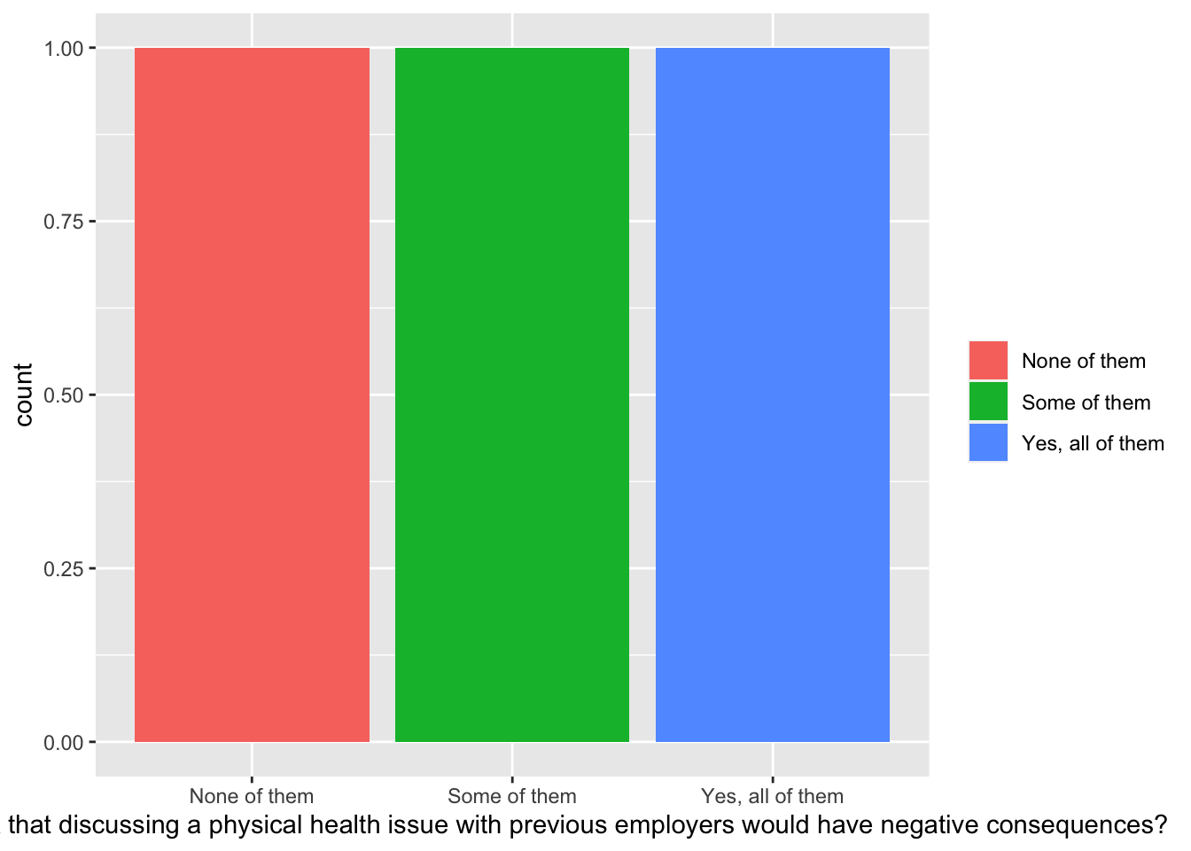
but it doesn’t work this way because if we use the x as answer they get separated we could use a trick
data %>%
  filter(!is.na(`Do you think that discussing a physical health issue with previous employers would have negative consequences?`)) %>%
  ggplot(aes(x=1,
             fill=`Do you think that discussing a physical health issue with previous employers would have negative consequences?`
  ))+
  geom_bar(position = "fill")+
  theme(legend.title = element_blank())
but its a trick a better way would be to calculate the values and percentages as well using summarise and mutate of the package dplyr
data %>%
  filter(!is.na(`Do you think that discussing a physical health issue with previous employers would have negative consequences?`)) %>%
  group_by(`Do you think that discussing a physical health issue with previous employers would have negative consequences?`) %>%
  summarise(count = n()) %>%
  mutate(percent = count / sum(count))
## # A tibble: 3 x 3
## `Do you think that discussing a physical health issue with prev… count percent
## <chr> <int> <dbl>
## 1 None of them 559 0.442
## 2 Some of them 631 0.499
## 3 Yes, all of them 74 0.0585now we can plot again
data %>%
  filter(!is.na(`Do you think that discussing a physical health issue with previous employers would have negative consequences?`)) %>%
  group_by(`Do you think that discussing a physical health issue with previous employers would have negative consequences?`) %>%
  summarise(count = n()) %>%
  mutate(percent = count / sum(count)) %>%
  ggplot(aes(
    x=1,
    y=percent,
    fill=`Do you think that discussing a physical health issue with previous employers would have negative consequences?`
  ))+
  geom_bar(stat = "identity", position = "fill")+
  theme(legend.title = element_blank())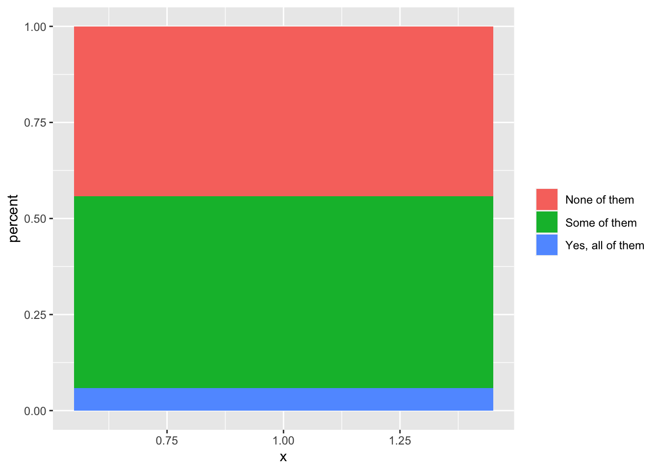
we can make it prettier, by adding labels to the axes and a proper title to the figure:
health_issue = data %>%
  filter(!is.na(`Do you think that discussing a physical health issue with previous employers would have negative consequences?`)) %>%
  group_by(`Do you think that discussing a physical health issue with previous employers would have negative consequences?`) %>%
  summarise(count = n()) %>%
  mutate(percent = count / sum(count)) %>%
  ggplot(aes(
    x=1,
    y=percent,
    fill=`Do you think that discussing a physical health issue with previous employers would have negative consequences?`
  ))+
  geom_bar(stat = "identity", position = "fill")+
  theme(legend.title = element_blank())+
  geom_text(aes(label = paste0(round(percent*100, digits = 1), "%")), position = position_stack(vjust = 0.5))+
  labs(x="",
       y="percent responses",
       title = "Do you think that discussing a physical health issue \nwith previous employers would have negative consequences?")+
  coord_flip()
And inspect the result:
plot(health_issue)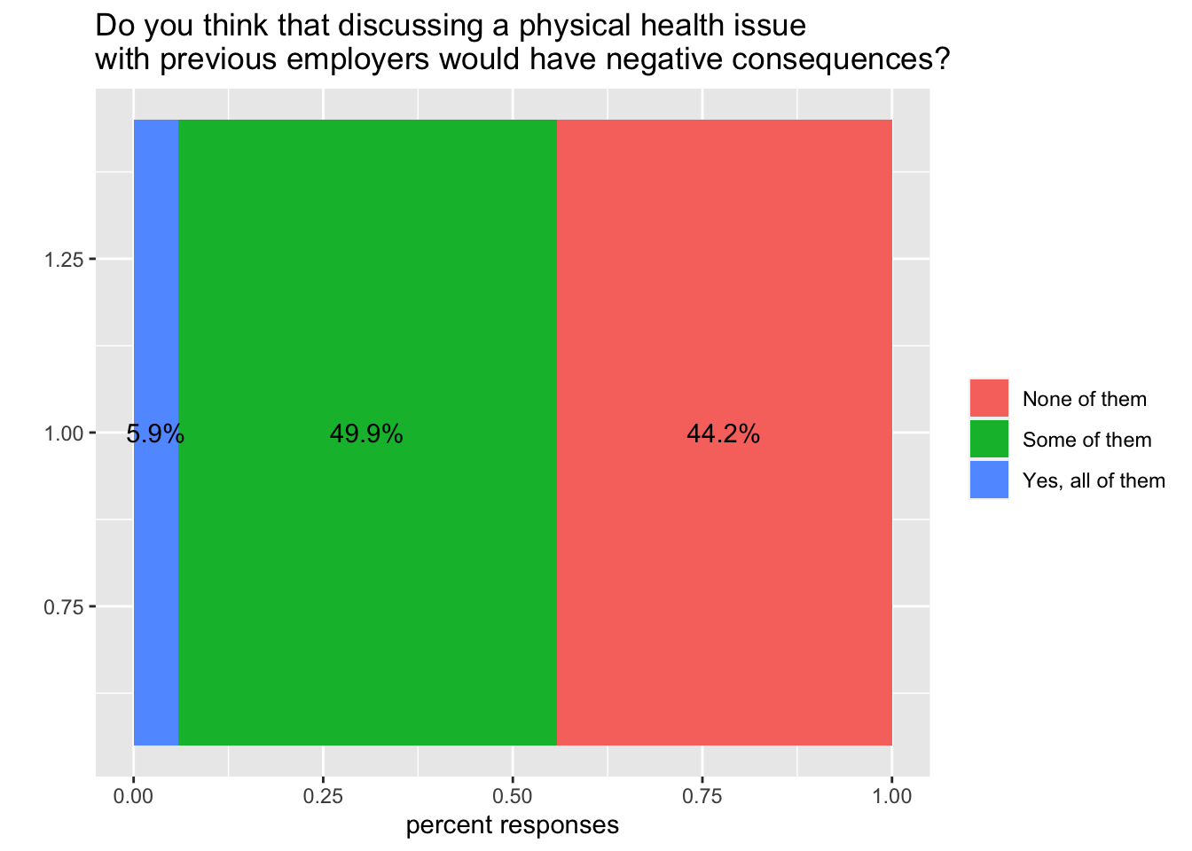
Now we have something interesting we can compare, and we can use the same code to plot the attitude towards mental issues instead:
mental_issue = data %>%
  filter(!is.na(`Do you think that discussing a mental health disorder with previous employers would have negative consequences?`)) %>%
  group_by(`Do you think that discussing a mental health disorder with previous employers would have negative consequences?`) %>%
  summarise(count = n()) %>%
  mutate(percent = count / sum(count)) %>%
  ggplot(aes(
    x=1,
    y=percent,
    fill=`Do you think that discussing a mental health disorder with previous employers would have negative consequences?`
  ))+
  geom_bar(stat = "identity", position = "fill")+
  theme(legend.title = element_blank())+
  geom_text(aes(label = paste0(round(percent*100, digits = 1), "%")), position = position_stack(vjust = 0.5))+
  labs(x="",
       y="percent responses",
       title = "Do you think that discussing a mental health disorder \nwith previous employers would have negative consequences?")+
  coord_flip()
And inspect the results:
plot(mental_issue)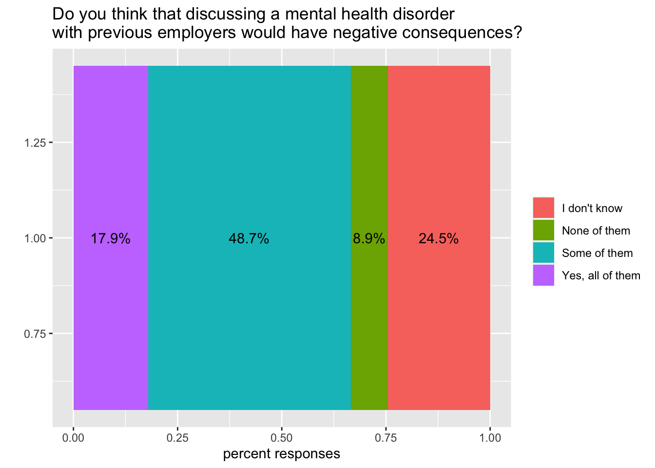
A very useful package named cowplot comes in very handy to combine plots together, and arrange them in a quite flexible way compared to the native grid system. Using this function we can combine the two plots above, and better visualise the comparison:
plot_grid(health_issue, mental_issue, labels = c('A', 'B'), label_size = 12, ncol = 1, align = 'v')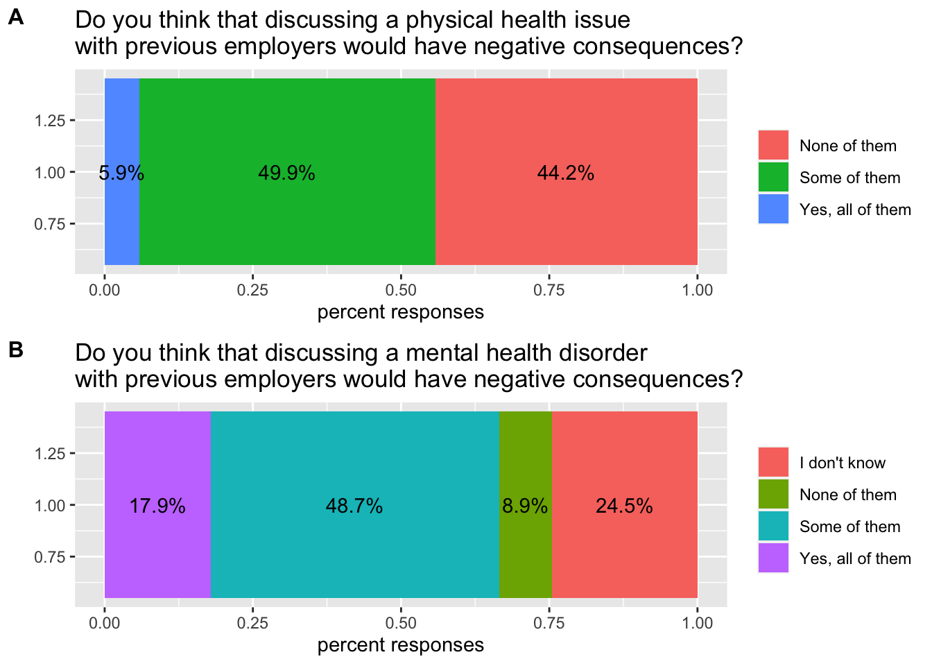
Since colours are chosen based on the categories available in the data, they are not in sync (we have a different number of categories in the two responses). To solve this, we need to choose a vector of colours, and use the same vector for both plots. Colours are assigned in the order we see in the legend: since the first category of the second plot is not present in the first plot, we need to start from the second colour in our vector when we describe the first plot.
colours = met.brewer("Derain", n=4)Now we can change the colours:
health_issue = health_issue + scale_fill_manual(values = colours[2:4])
mental_issue = mental_issue + scale_fill_manual(values = colours)
And assemble the group again
plot_grid(health_issue, mental_issue, labels = c('A', 'B'), label_size = 12, ncol = 1, align = 'v')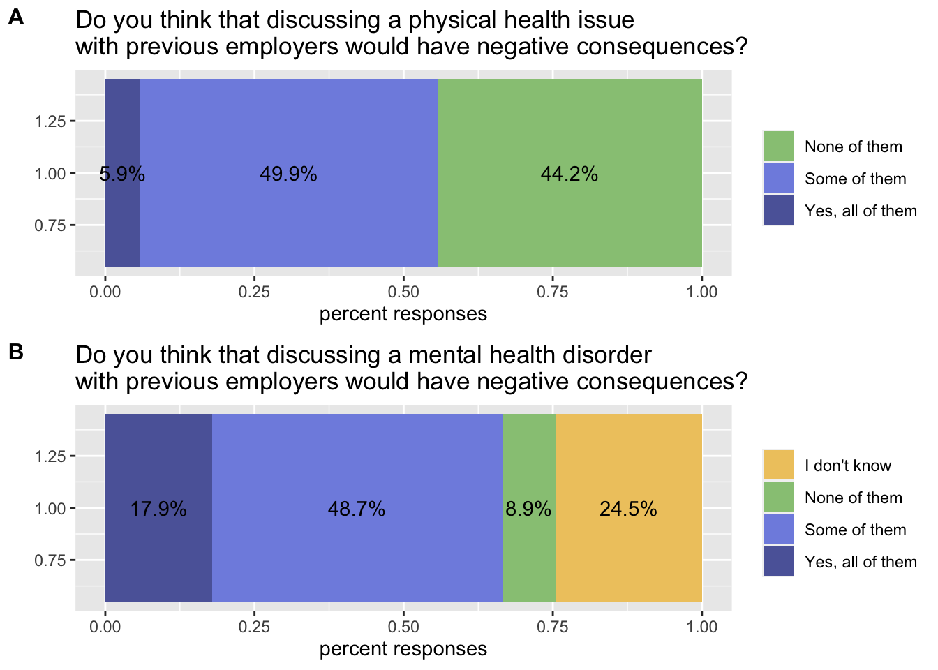
If we look closely, we realise that we can be more picky in terms of axes and tick marks
health_issue = health_issue + theme(
  axis.text = element_blank(),
  axis.ticks = element_blank(),
  plot.background = element_blank(),
  panel.grid = element_blank()
)

mental_issue = mental_issue + theme(
  axis.text = element_blank(),
  axis.ticks = element_blank(),
  plot.background = element_blank(),
  panel.grid = element_blank()
)
And assemble it again:
plot_grid(health_issue, mental_issue, labels = c('A', 'B'), label_size = 12, ncol = 1, align = 'v')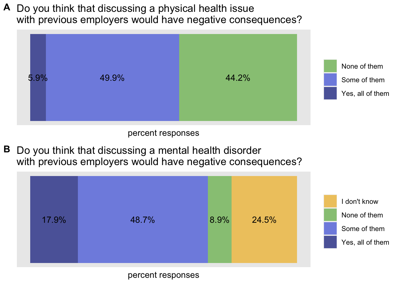
We might want to add information here, and for example explore the age distribution. However, we don’t want all single age points, but we’d like to have age groups so we can use data transformation to assemble them as follows:
age_distribution = data %>%
  mutate(age_group = cut(
    `What is your age?`,
    breaks = c(0, 20, 25, 30, 35, 40, 45, 50, 55, 60, 100),
    labels = c("Under 20", "20-25", "26-30", "31-35", "36-40", "41-45", "46-50", "51-55", "56-60", "Over 60")
    )) %>%
  filter(!is.na(age_group))%>%
  ggplot(aes(x=age_group, fill=`Have you been diagnosed with a mental health condition by a medical professional?`))+
  geom_bar(position = "dodge")+
  theme(legend.title = element_blank())+
  labs(title="Have you been diagnosed with a mental health condition \nby a medical professional?")+
  scale_fill_manual(values=met.brewer("Juarez", 2))
Let’s see the result:
plot(age_distribution)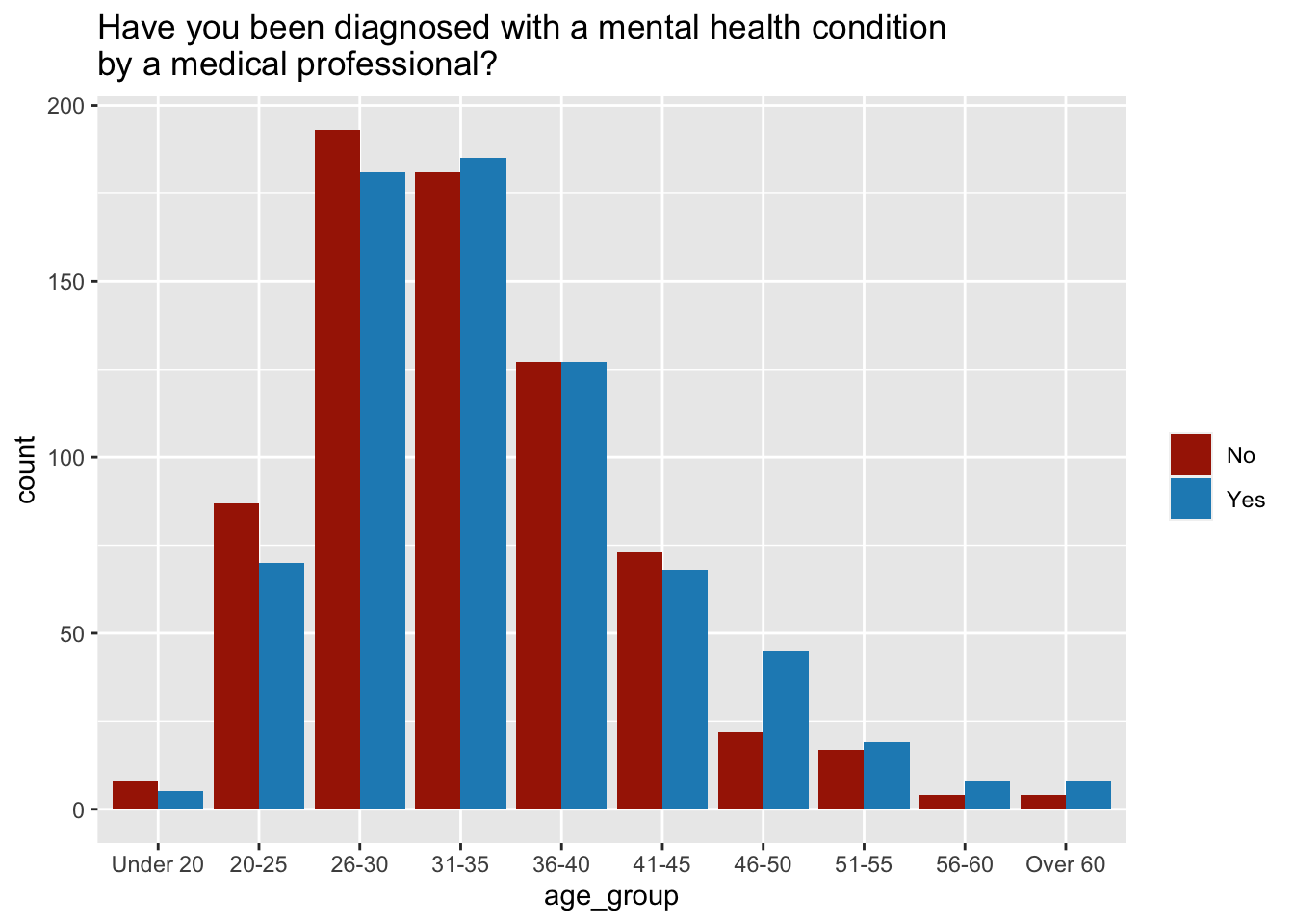
As someone pointed out though, comparison of bars across a span of age groups might be confusing: so we either split the groups, or we use in this case lines do better describe the differences. In this case we need however to change 2 things: - x axis should be continuous - if x is not continuous, stat should be count (as in bars) - x should be numeric: in order to do that, we need to use the factor of its values - we need to add the group element on top of the colour
age_distribution = data %>%
  mutate(age_group = cut(
    `What is your age?`,
    breaks = c(0, 20, 25, 30, 35, 40, 45, 50, 55, 60, 100),
    labels = c("Under 20", "20-25", "26-30", "31-35", "36-40", "41-45", "46-50", "51-55", "56-60", "Over 60")
    )) %>%
  filter(!is.na(age_group)) %>%
  ggplot(aes(x=factor(age_group),
             colour=`Have you been diagnosed with a mental health condition by a medical professional?`,
             group = `Have you been diagnosed with a mental health condition by a medical professional?`))+
  geom_freqpoly(stat = "count")+
  theme(legend.title = element_blank())+
  labs(title="Have you been diagnosed with a mental health condition \nby a medical professional?",
       x = "age group")+
  scale_fill_manual(values=met.brewer("Juarez", 2))
let’s see the result:
plot(age_distribution)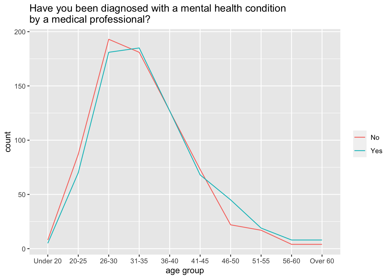
Another element which might help us telling a story, is the question whether the employers take mental health seriously. In order to display a proportion, we might want to build a pie chart.
data %>%
  group_by(`Do you feel that your employer takes mental health as seriously as physical health?`) %>%
  summarise(count = n()) %>%
  mutate(percent = count / sum(count) * 100,
         response = `Do you feel that your employer takes mental health as seriously as physical health?`) %>%
  select(response, count, percent) %>%
  filter(!is.na(response)) %>%
  ggplot(aes(x="", y=percent, fill=response)) +
  geom_bar(stat="identity", width=1) +
  coord_polar("y", start=0)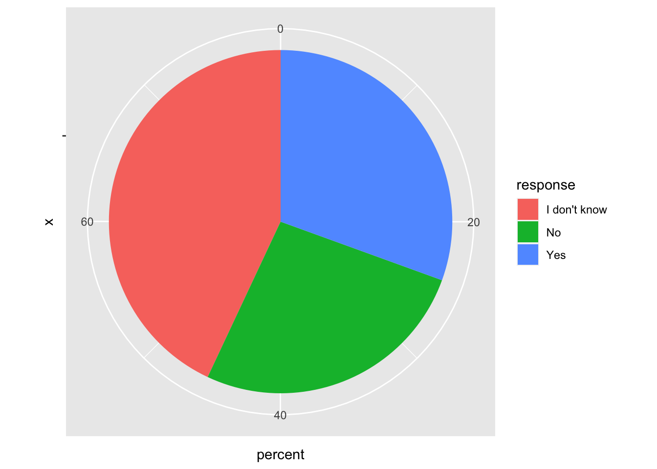
Progressively, we should remove all additional elements we don’t need:
data %>%
  group_by(`Do you feel that your employer takes mental health as seriously as physical health?`) %>%
  summarise(count = n()) %>%
  mutate(percent = count / sum(count) * 100,
         response = `Do you feel that your employer takes mental health as seriously as physical health?`) %>%
  select(response, count, percent) %>%
  filter(!is.na(response)) %>%
  ggplot(aes(x="", y=percent, fill=response)) +
  geom_bar(stat="identity", width=1) +
  coord_polar("y", start=0)+
  theme_void()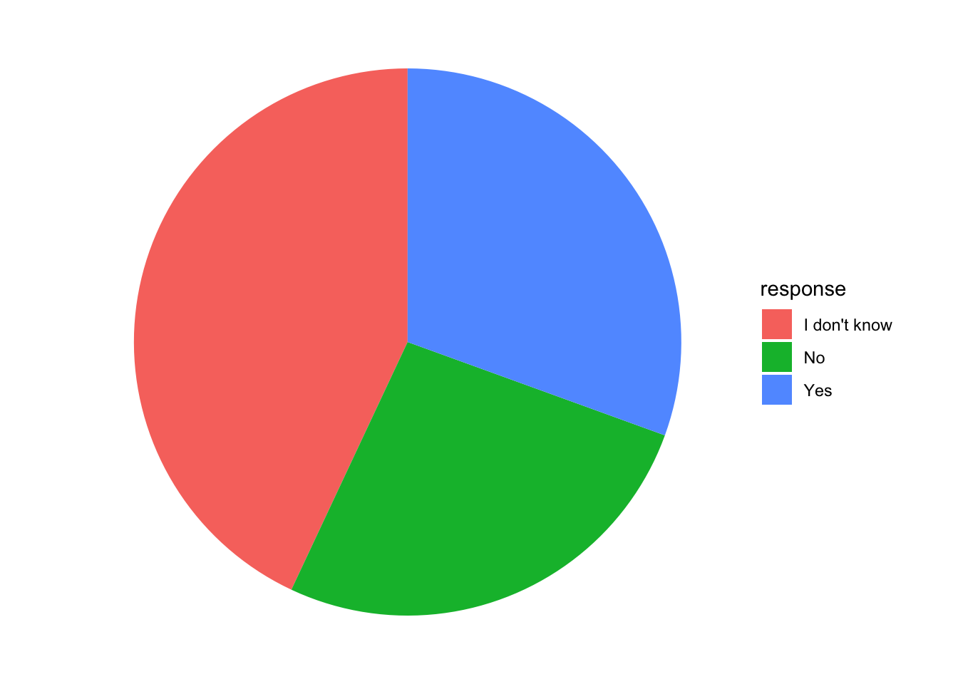
Then, we can add labels. In order to create the labels, we need first to create them from a numeric value and also use the value to compute the position of the labels on the pie chart (note the position is relative to the proportion compared to the total). We can use the percentage as label.
employer = data %>%
  group_by(`Do you feel that your employer takes mental health as seriously as physical health?`) %>%
  summarise(count = n()) %>%
  mutate(percent = count / sum(count) * 100,
         response = `Do you feel that your employer takes mental health as seriously as physical health?`,
         percent_label = paste0(round(percent, digits = 1), "%")
         ) %>%
  arrange(percent) %>%
  select(response, count, percent, percent_label) %>%
  filter(!is.na(response)) %>%
  mutate(label_pos = cumsum(percent) - 0.5 * percent) %>%
  ggplot(aes(x="", y=percent, fill=response)) +
  geom_bar(stat="identity", width=1) +
  coord_polar("y", start=0)+
  theme_void()+
  geom_text(aes(y = label_pos, label = percent_label), color = "white", size=5) +
  scale_fill_manual(values = met.brewer("Egypt", n=3))+
  labs(title = "Do you feel that your employer takes \nmental health as seriously as physical health?")
Let’s see the result:
plot(employer)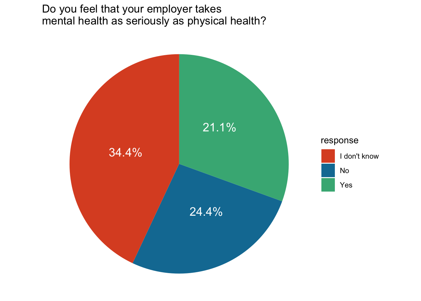
We have discussed what the problem with pie charts might be. In this particular case the difficulty in spotting patterns is less of a problem, because:
- we added in the labels with percentages
- we only have three categories
As an alternative, we could use the tree map plot.
First, we should save the colours so we can produce a plot with similar feeling:
egypt_cols3 = met.brewer("Egypt", n=3)Then we can use the package treemapify to change it to a treemap
employers2 = data %>%
  group_by(`Do you feel that your employer takes mental health as seriously as physical health?`) %>%
  summarise(count = n()) %>%
  mutate(percent = count / sum(count) * 100,
         response = `Do you feel that your employer takes mental health as seriously as physical health?`,
         percent_label = paste0(round(percent, digits = 1), "%")
  ) %>%
  arrange(percent) %>%
  select(response, count, percent, percent_label) %>%
  filter(!is.na(response)) %>%
  ggplot(aes(area=percent, fill=response, label = percent_label)) +
  geom_treemap()+
  geom_treemap_text()+
  scale_fill_manual(values = c("No" = egypt_cols3[1],
                               "Yes" = egypt_cols3[3],
                               "I don't know" = egypt_cols3[2]))+
  labs(title = "Do you feel that your employer takes \nmental health as seriously as physical health?")
Let’s see the result
plot(employers2)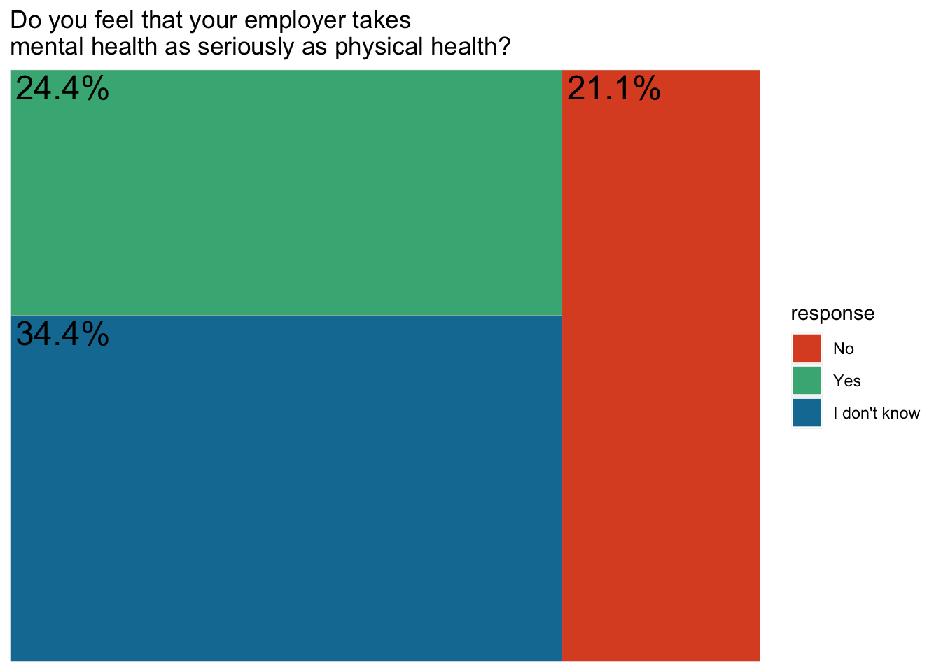
Now let’s assemble everything together:
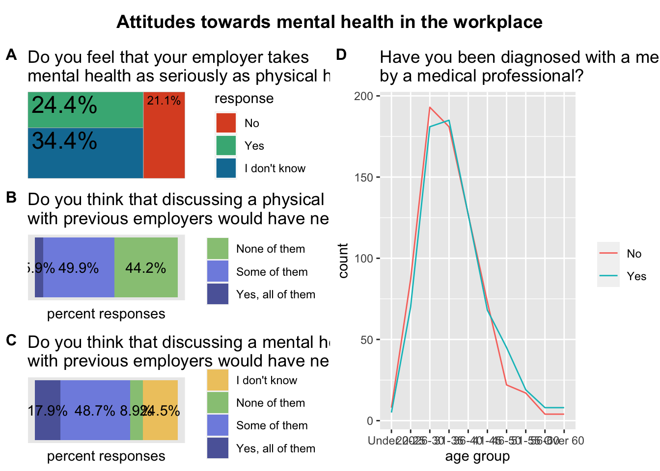
grid_left <- plot_grid(employers2, health_issue, mental_issue, labels = c('A', 'B', 'C'), label_size = 12, ncol = 1, align = 'v')
grid_right <- plot_grid(age_distribution, labels = c('D'), label_size = 12, ncol = 1, align = 'v')
And plot it:
plot_grid(grid_left, grid_right, labels = c(''), ncol = 2)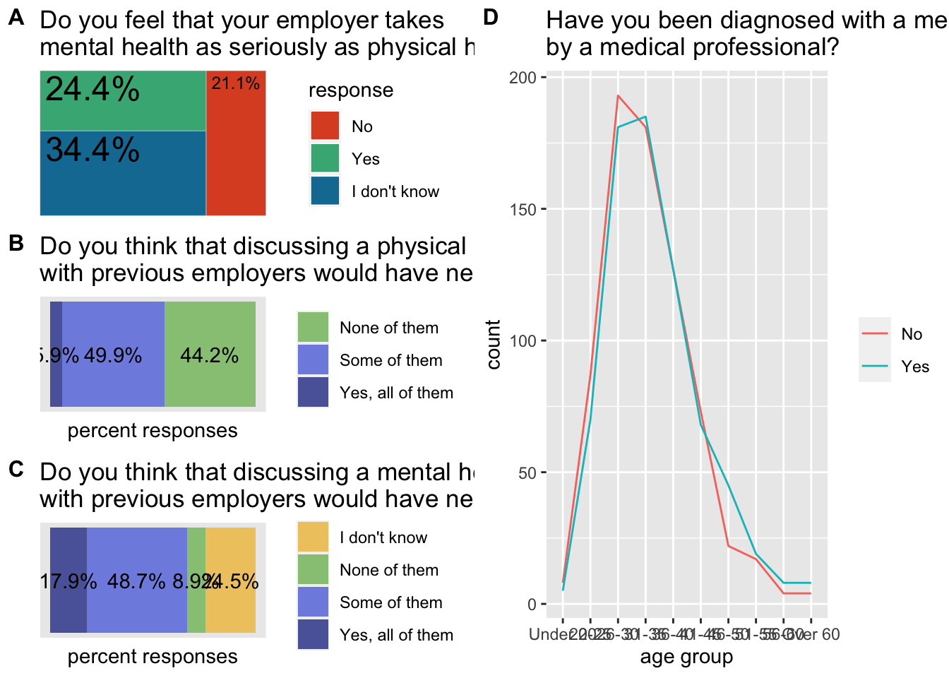
We can also save this in an SVG, which would help making further adjustments without spending additional hours in R:
svg(filename = "storytelling_mental-health.svg", width = 11, height = 8)
plot_grid(grid_left, grid_right, labels = c(''), ncol = 2)
dev.off()
## quartz_off_screen
## 2If we wanted to complete the poster with an overall title, this can be also done assembling layers of plots with cowplot.
We can start by making a title (it has to be done with very basic functions):
title <- ggdraw()+
  draw_label("Attitudes towards mental health in the workplace", fontface = "bold")
We can save the main poster as an object:
main_poster <- plot_grid(grid_left, grid_right, labels = c(''), ncol = 2)And then assemble the two also using the function plot_grid
plot_grid(
  title,
  main_poster,
  ncol = 1,
  rel_heights = c(0.1,1)
)