Intro
This document presents possible solutions to the assignment given during the workshop on dataviz, Ph.D. retreat 2022.
Preparation
Libraries
library(tidyverse)
library(cowplot)
library(gghighlight)
library(knitr)
library(MetBrewer)
Loading data
music <- read_csv("https://raw.githubusercontent.com/lescai-teaching/dataviz-rstudio/datasets/music_sales_history.csv",
                  col_names = c("format", "metric", "year", "records", "value"),
                  col_types = c(col_character(),
                                col_character(),
                                col_double(),
                                col_double(),
                                col_double()),
                  skip = 1)
Tidying the data
simplifying the column name
music$metric <- ifelse(
  music$metric == "Value (Adjusted)",
  "adjusted_value",
  music$metric
)
some data are duplicated or missing
music[duplicated(music),]## # A tibble: 39 x 5
## format metric year records value
## <chr> <chr> <dbl> <dbl> <dbl>
## 1 Paid Subscriptions Units 1973 1 NA
## 2 Paid Subscriptions Units 1974 1 NA
## 3 Paid Subscriptions Units 1975 1 NA
## 4 Paid Subscriptions Units 1976 1 NA
## 5 Paid Subscriptions Units 1977 1 NA
## 6 Paid Subscriptions Units 1978 1 NA
## 7 Paid Subscriptions Units 1979 1 NA
## 8 Paid Subscriptions Units 1980 1 NA
## 9 Paid Subscriptions Units 1981 1 NA
## 10 Paid Subscriptions Units 1982 1 NA
## # … with 29 more rowsDespite check, some data still seem to be duplicated, so when we group we’re just gonna choose the first value
music_tidy = music %>%
  filter(!is.na(value)) %>%
  pivot_wider(
    names_from = metric,
    values_from = value,
    values_fn = first
  )
the categories are pretty broad
unique(music_tidy$format)## [1] "CD" "CD Single"
## [3] "Cassette" "Cassette Single"
## [5] "LP/EP" "Vinyl Single"
## [7] "8 - Track" "Other Tapes"
## [9] "Music Video (Physical)" "DVD Audio"
## [11] "SACD" "Download Single"
## [13] "Download Album" "Kiosk"
## [15] "Download Music Video" "Ringtones & Ringbacks"
## [17] "Paid Subscriptions" "Limited Tier Paid Subscription"
## [19] "On-Demand Streaming (Ad-Supported)" "Other Ad-Supported Streaming"
## [21] "Other Digital" "Paid Subscription"
## [23] "SoundExchange Distributions" "Synchronization"In order to reduce them, we need to create a new category where we can simplify the existing media type descriptions:
music_tidy = music_tidy %>%
  mutate(
    media = case_when(
      grepl("CD", format) ~ "CD_DVD",
      grepl("DVD", format) ~ "CD_DVD",
      grepl("LP", format) ~ "Vinyl",
      grepl("Vinyl", format) ~ "Vinyl",
      grepl("Cassette", format) ~ "Cassette",
      grepl("Track", format) ~ "Vinyl",
      grepl("Download", format) ~ "Digital",
      grepl("Subscription", format) ~ "Digital",
      grepl("Ring", format) ~ "Digital",
      grepl("Streaming", format) ~ "Digital",
      grepl("Digital", format) ~ "Digital",
      grepl("Sync", format) ~ "Digital",
      grepl("SoundExchange", format) ~ "Digital",
      grepl("Tapes", format) ~ "Cassette",
      grepl("Physical", format) ~ "CD_DVD",
      grepl("Kiosk", format) ~ "Vinyl"
    )
  )
Plotting
Stacked Area chart
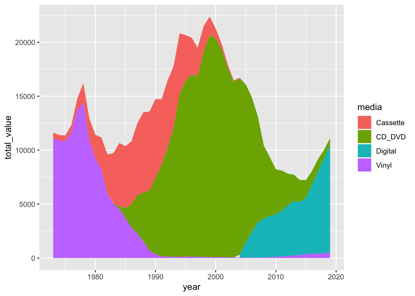
The most common way to represent these data is a stacked area chart, to show both evolution and relative proportions of sales of different media types over the years.
music_tidy %>%
  group_by(media, year) %>%
  summarise(total_value = sum(adjusted_value, na.rm = TRUE)) %>%
  ggplot(aes(x=year, y=total_value, fill=media))+
  geom_area(position = "stack")
Beeswarm plot
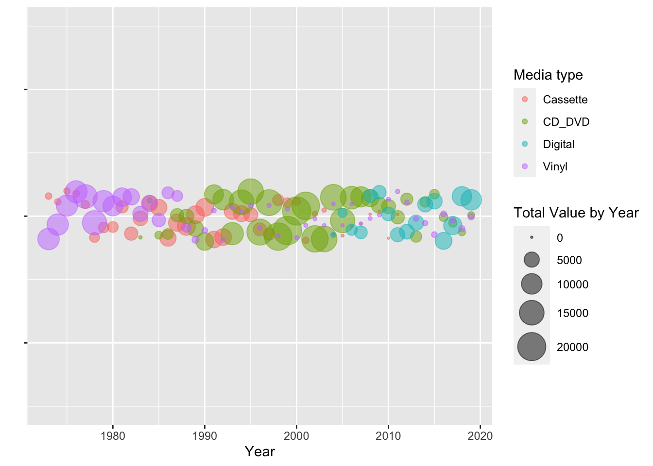
We can also reproduce a beeswarm-like plot this way:
music_tidy %>%
  group_by(media, year) %>%
  summarise(total_value = sum(adjusted_value, na.rm = TRUE)) %>%
  ggplot(aes(x=year, y=0, colour=media, size = total_value))+
  geom_jitter(width = 0.005, alpha = 0.5)+
  ylim(-3,3)+
  scale_size(range = c(0.5, 10), name="Total Value by Year")+
  labs(
    x = "Year",
    y = "",
    colour = "Media type"
  )+
  theme(axis.text.y = element_blank())